
More than half of corporate learners access training on a mobile device at least some of the time. For frontline workers — retail, manufacturing, healthcare, field services — mobile isn’t a convenience. It’s the only option. They don’t sit at desks. They don’t have dedicated training time. They learn in break rooms, on the floor, between shifts.
And yet most corporate eLearning is still designed for a desktop browser and then “made responsive” as an afterthought. The result is a desktop experience squeezed onto a small screen — tiny text, awkward interactions, and layouts that require constant pinching and scrolling. Responsive isn’t the same as mobile-designed. Here’s the difference and how to get it right.
Responsive design is not mobile design
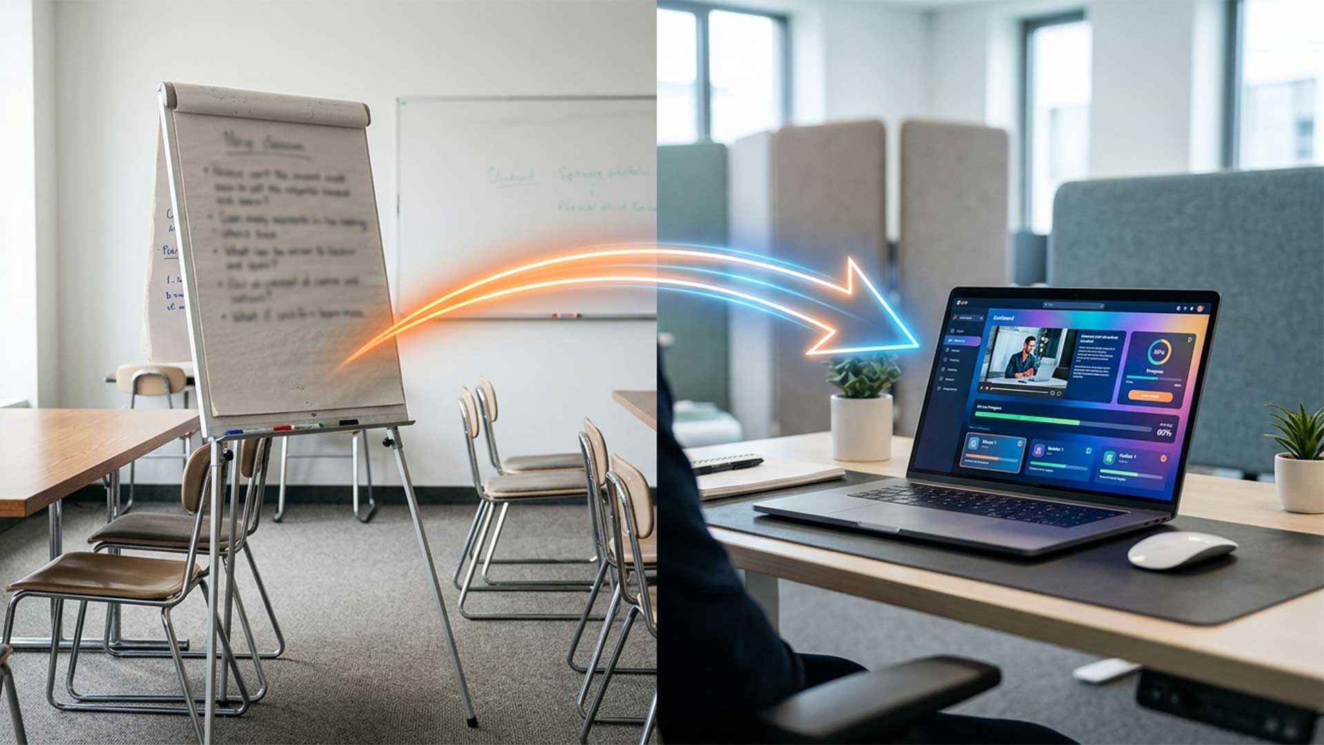
Responsive design means the layout adjusts to different screen sizes. The same content rearranges itself to fit a phone screen. This solves the display problem — content doesn’t overflow or break — but it doesn’t solve the experience problem.
A desktop eLearning module might have a two-column layout with an image on the left and text on the right, drag-and-drop interactions that require precision mouse control, hover-triggered tooltips, and dense paragraphs of text. When this goes responsive, the columns stack vertically, the drag-and-drop becomes unusable on touch, the hover states disappear entirely, and the dense paragraphs create walls of text on a five-inch screen.
Mobile design means designing the experience for a small touch screen from the start — then scaling up for desktop, not the other way around. The content, interactions, and layout are conceived for the constraints of mobile, and the desktop version gets the benefit of more space.
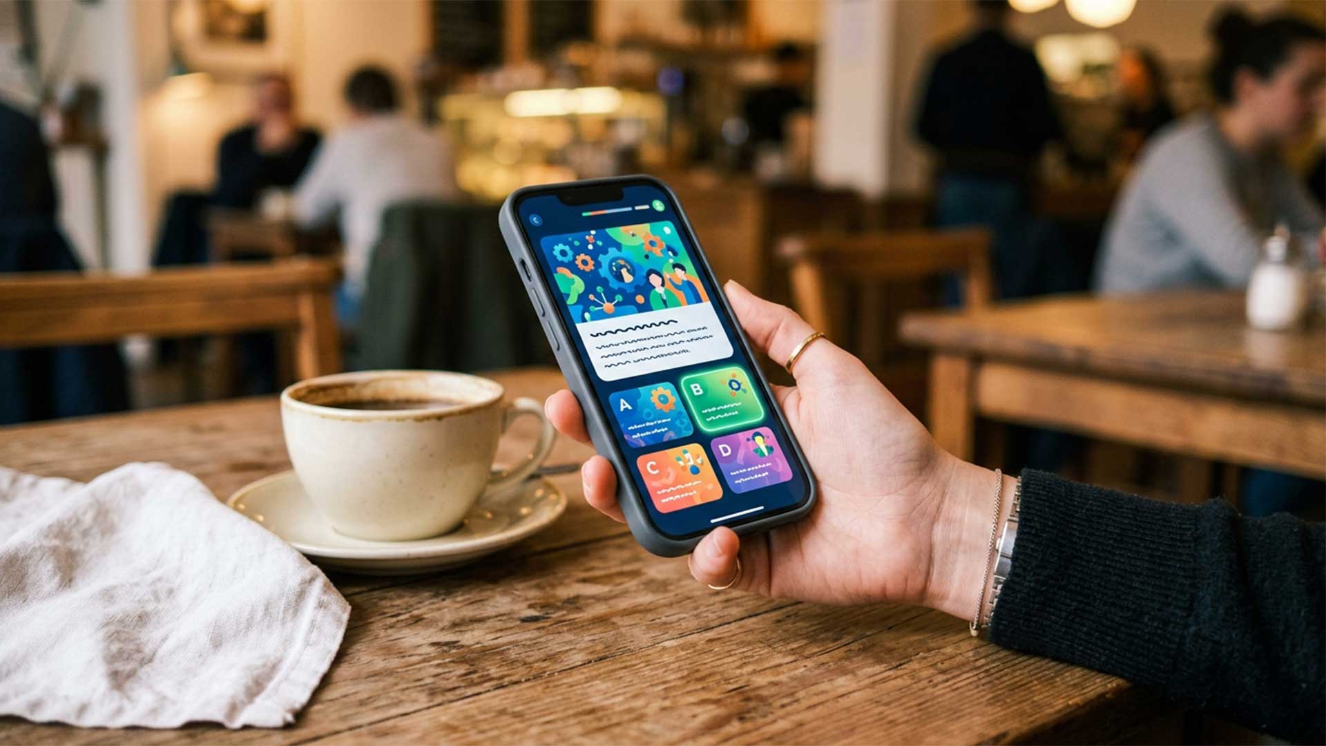
Design for thumb zones and touch targets
On a phone, people interact with their thumbs. The comfortable reach zone is the lower two-thirds of the screen, with the center and bottom being the easiest areas to tap. Navigation elements, buttons, and interactive controls should live in this zone whenever possible.
Touch targets need to be large enough to tap accurately. The minimum recommended size is 44 by 44 pixels — anything smaller and users will miss-tap, which causes frustration that has nothing to do with the content. Buttons, radio options, and interactive elements should have generous padding around them.
Avoid interactions that require precision. Drag-and-drop is the biggest offender — what works smoothly with a mouse becomes an exercise in frustration on a touch screen. Replace drag-and-drop with tap-to-select or tap-to-reorder interactions. The learning objective is the same — only the interaction method changes.
Keep screens short and single-focused
Desktop eLearning can afford dense screens with multiple elements — text, images, interactions, and navigation all visible at once. Mobile screens can show one thing at a time, and that’s not a limitation. It’s a design advantage.
Each mobile screen should have one focus: one concept, one question, one interaction, one piece of media. When a screen tries to do two things, the learner has to scroll to find the second thing — and scrolling past content reduces engagement and comprehension.
This means breaking longer content into more screens, each with less on it. A desktop screen with four paragraphs and a diagram becomes four mobile screens: intro text, key concept, diagram with a brief label, and a knowledge check. The total content is the same. The experience is dramatically better.
Optimize media for mobile constraints
Video on mobile needs different treatment than video on desktop. Keep videos under three minutes — mobile learners are often in environments where they can be interrupted at any time. A seven-minute video that requires uninterrupted viewing doesn’t fit mobile reality.
Always include captions. Mobile learners frequently watch without sound — in break rooms, on public transit, in shared spaces. If your video relies on audio without captions, half your mobile audience is getting an incomplete experience.
Images should be high contrast and simple. Detailed diagrams that are readable on a 24-inch monitor become unreadable on a phone. If an image contains text or fine detail, consider replacing it with a simplified version for mobile or providing a tap-to-zoom function.
Audio narration works well on mobile for learners who prefer listening over reading — but always provide a text alternative. Some environments don’t allow audio. Some learners prefer reading. Forcing one modality reduces accessibility and engagement.
Test on real devices — not just browser simulators
Browser developer tools can simulate mobile screen sizes, and they’re useful for checking layout. But they don’t replicate the actual experience of using the training on a phone.
Test on real devices — at minimum, a recent iPhone and a recent Android phone. Test on the actual devices your learners use, if you know what they are. Load the training on cellular data, not Wi-Fi, to check performance with slower connections. Use your thumb, not a stylus. Try completing the training while standing up, while walking, while holding a coffee — because that’s how your learners will experience it.
The issues you find during real-device testing are different from what browser simulators reveal. Touch targets that look fine on screen are too small in practice. Scroll behavior that seems smooth in simulation stutters on older devices. Media that loads instantly on Wi-Fi takes ten seconds on a cell connection in a warehouse.
Design for interrupted learning
Mobile learners don’t complete training in a single sitting. They start during a break, get called back to work, and return later — maybe hours later, maybe the next day. Your design needs to accommodate this reality.
Save progress automatically and frequently. Every completed screen should be bookmarked so the learner returns to exactly where they left off. If the learner has to start over or search for their place, they won’t come back.
Make each section self-contained enough that a learner can return after an interruption without rereading the previous section. A brief contextual reminder at the start of each section — one sentence summarizing where they are in the sequence — helps learners re-orient without repeating content.
Design for five-minute sessions. If a learner can complete a meaningful section in five minutes, they’ll use the gaps in their day productively. If every section requires fifteen uninterrupted minutes, they’ll wait for a time that never comes.